Gibberish Is Now Available on TestFlight
This post first appeared on my Gibberish blog.
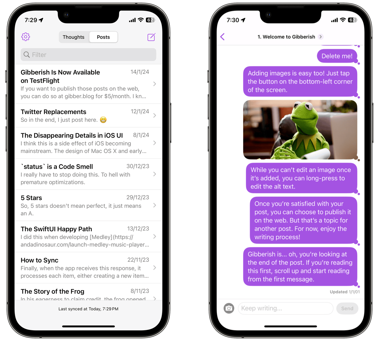
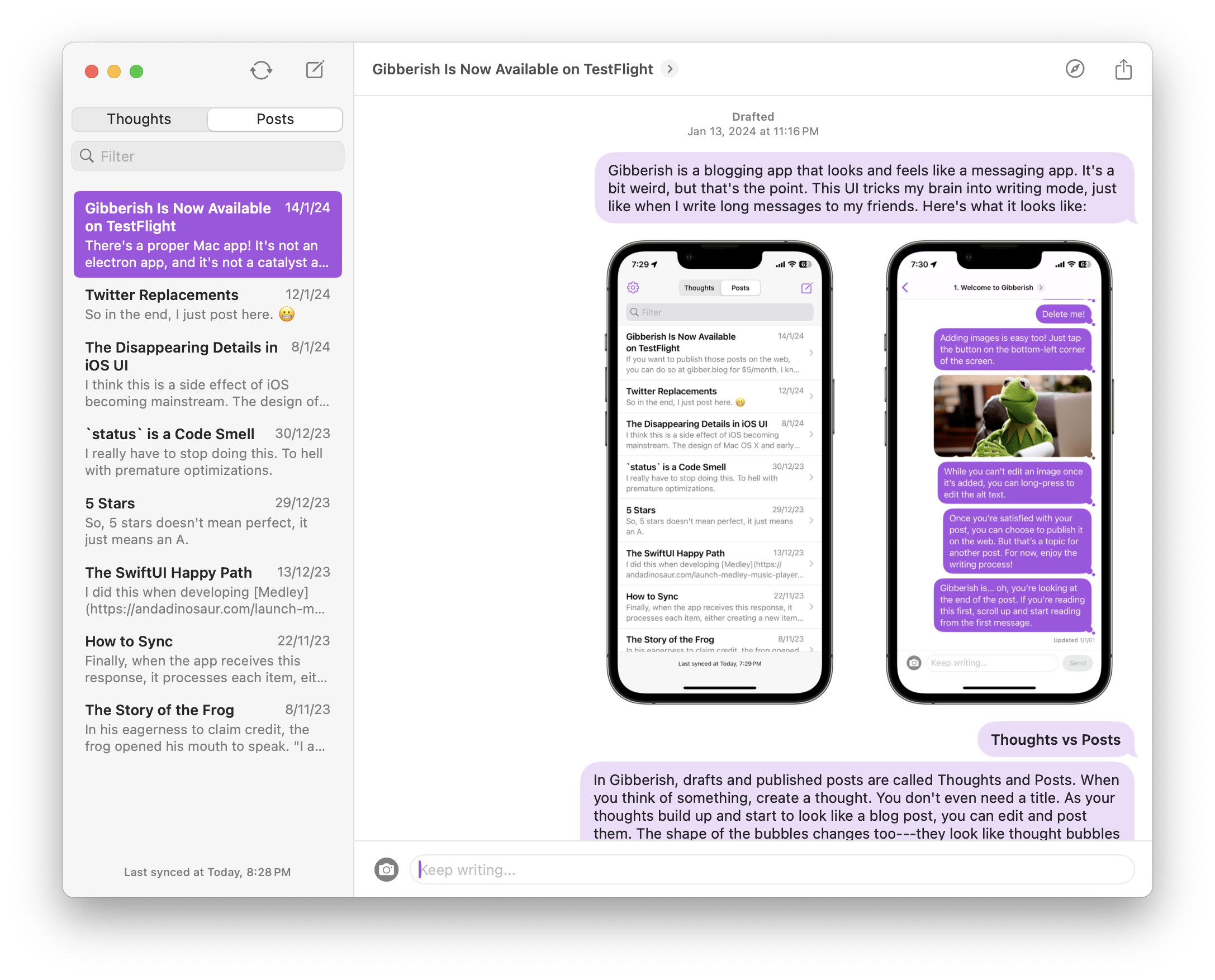
Gibberish is a blogging app that looks and feels like a messaging app. It’s a bit weird, but that’s the point. This UI tricks my brain into writing mode, just like when I write long messages to my friends. Here’s what it looks like:

Thoughts and Posts
In Gibberish, drafts and published posts are called Thoughts and Posts. When you think of something, create a Thought. You don’t even need a title. As your thoughts build up and start to look like a blog post, you can edit and post them. The shape of the bubbles changes too—they look like thought bubbles in a Thought, and chat bubbles in a Post.
Chrome is Good
Many “minimal” text editors hide the chrome (lowercase) in the writing screen to help you focus. But for me, it didn’t help. It gave me a writer’s block. I propose the opposite: the more chrome on the screen, the smaller the text input field is, the more users are willing to type text in them. Typing in a giant blank screen feels like a chore. But typing in a tiny text field feels effortless.
Miscellaneous Info
There’s a Mac app! It’s not an Electron app, and it’s not a Catalyst app based on the iPad version. I even backported Gibberish to iOS 16 and macOS 12 Monterey.

There’s also a web app if you like that sort of thing. The web app works well on mobile too.
Gibberish supports sync in the traditional sense of the word. It means you can write your posts when you don’t have an internet connection, let it sync, then see your posts appear on the web, just like they’re supposed to.
The app icon is a (chonky) fleuron.
What about Feature X…
“What about scheduled posts?” This question helped me decide which direction to take Gibberish in. Implementing scheduled posts isn’t hard. But if I do that, do I also want to implement features like analytics, multi-author support, or email newsletters? What about social media integration, built-in SEO tools, or a plugin ecosystem? At that point, you might as well use Wordpress.
Gibberish doesn’t have those features, it’s meant to be easy to understand. I want my users to use almost all of the features in Gibberish, not just 10%. Users are supposed to click around the Gibberish app, look at the post information etc, and ask, “Is that all?” That’s a good thing.
Gibber.blog and Pricing
Gibberish is now available on TestFlight. It’s not in the App Store yet, but I’ve thought about the pricing. The app will be $0.99. I don’t want to make it free because it attracts unwanted 1-star reviews. You can use it as a private tweetstorm note-taking app.
Gibberish is available for $0.99 on the App Store. It’s a universal purchase, so once you buy it, you can use it on all your Apple devices.
If you want to publish those posts on the web, you can do so at gibber.blog for $5/month. If you’re interested in trying Gibberish, please send me an email or DM me your email on Mastodon. I’ll send you an invite to the beta.

