Random SwiftUI Complaint #123
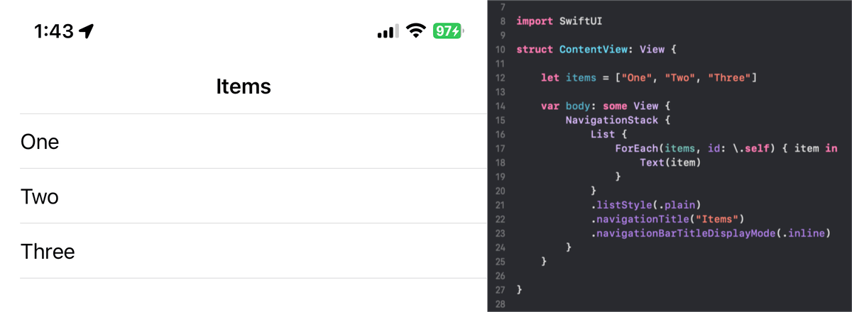
SwiftUI can be really annoying when you try to do basic UI customization. Consider this list:

Let’s say you want to get rid of the left padding of the separators. After some googling (which is another problem because Google thinks you want to remove the separators completely), you find the .alignmentGuide modifier with .listRowSeparatorLeading. So you add the code:
.alignmentGuide(.listRowSeparatorLeading) { _ in
    -100 // set it to -100 just to be safe
}
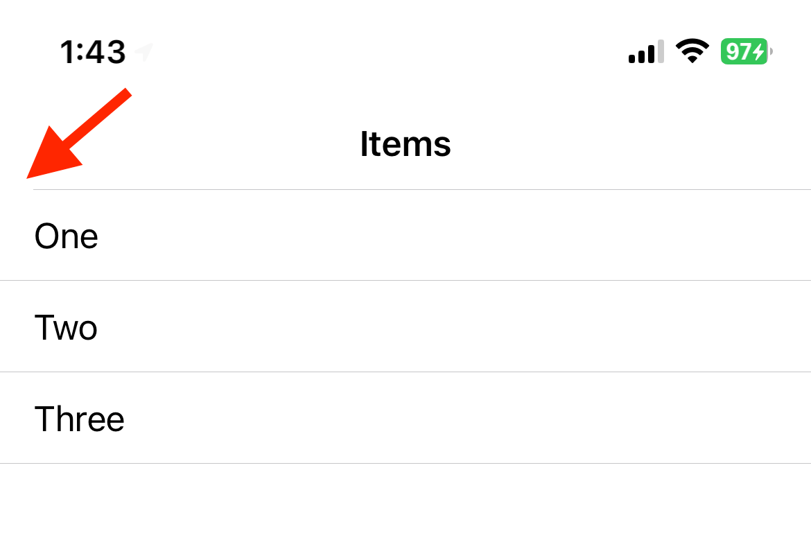
But the navigation bar’s separator still has the padding:

You don’t want to switch to .listStyle(.inset) because that would remove the navigation bar’s separator. After more googling, you find nothing useful. But setting .toolbarBackground to .visible will make the separator full-width. So you add the code:
.toolbarBackground(.visible, for: .navigationBar)
The navigation bar now has an off-white background color, but you can live with that. The separator seems to be full-width!
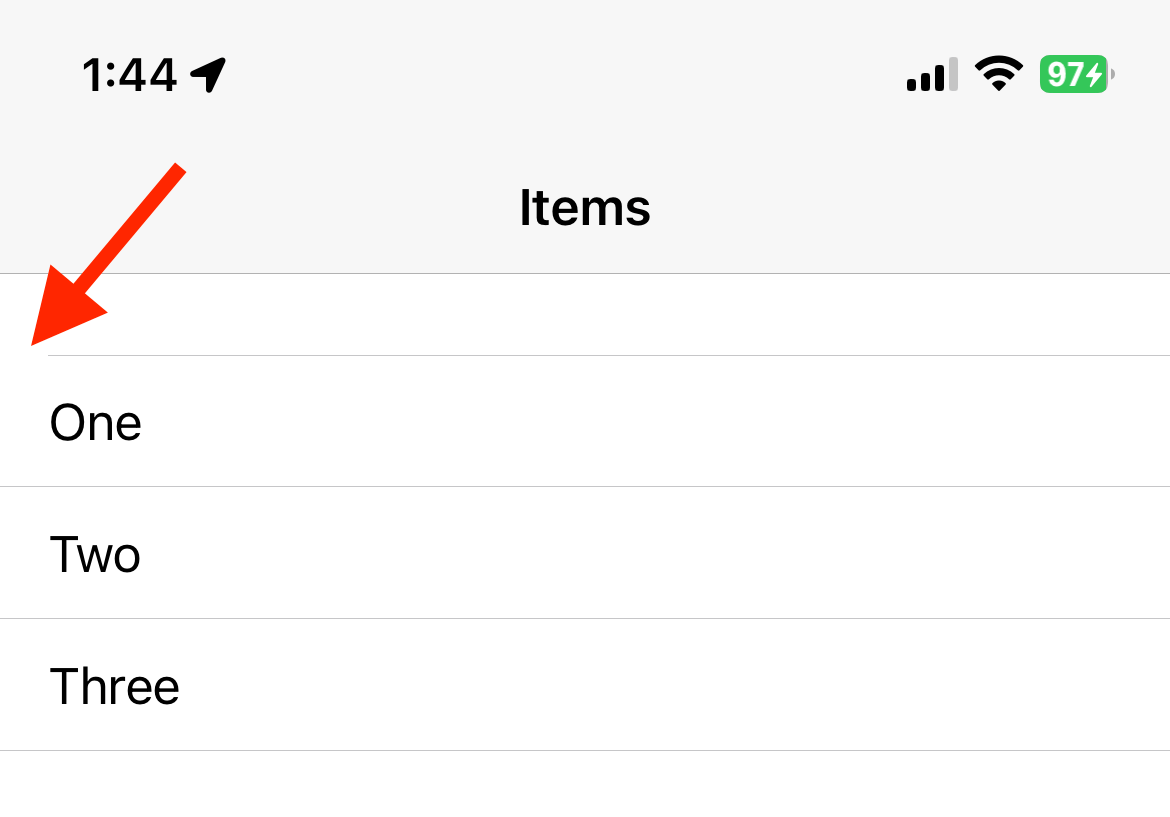
… until you pull down the list:

After even more googling, you cannot find any way to remove the left padding of this first separator. The closest thing you can do is to use a .listSectionSeparator modifier to hide it. So you do that:
.listSectionSeparator(.hidden, edges: .top)
Of course, the “real SwiftUI way” is to not remove the left padding of the separators. But sometimes you just want things to look a certain way, right? And that’s where SwiftUI can really, uhh, test your patience.

