

Redesigning the Subscription Flow, Part 1
The subscribe button in Time Capsule is not very obvious, and I’m starting to think it’s a mistake.
Time Capsule has a subscription service where you pay $3/month for syncing and sharing your saved pages, and it lets you use the desktop browser extensions. Here’s how the button looked like:
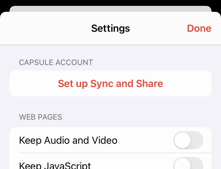
At first, I thought if you don’t need the subscription, I won’t blast it in your face, “Subscribe! Subscribe!” I wanted it to be non-obvious. But it felt like a half-assed job: The button doesn’t even say “subscribe.” Does it cost money? WTF does Set up Sync and Share even mean?
So I redesigned the button:
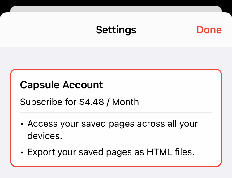
Is it too wordy? I don’t know. But at least it’s clearer and communicates the benefits of Capsule Account better. It’s less subtle than I hoped for, but developers have to eat.