

My SwiftUI Wishlist for WWDC
These are some SwiftUI weirdness I discovered while making History Book. I hope they get fixed at WWDC.
This list is incomplete. I only include things that seem straightforward to fix.
1. View modifiers that work as expected
I wish it is possible to change the background of a List with a .background() modifier.
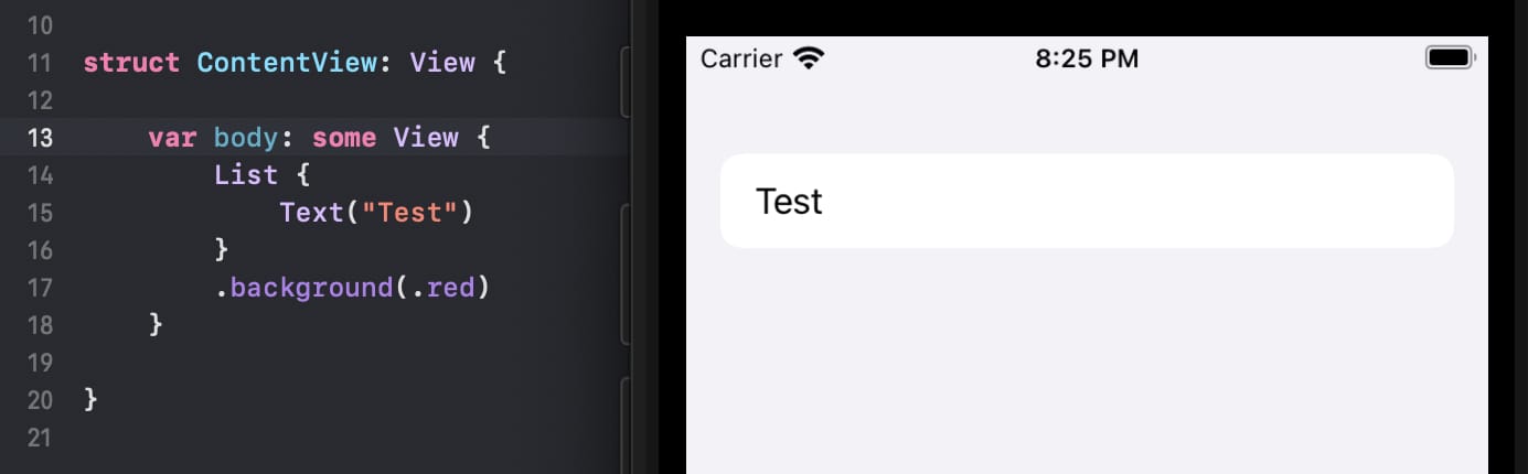 Yes, I’m aware of the UIKit workaround.
I also wish it is possible to change the height and width of a .sheet with a .frame(height:width:) modifier.
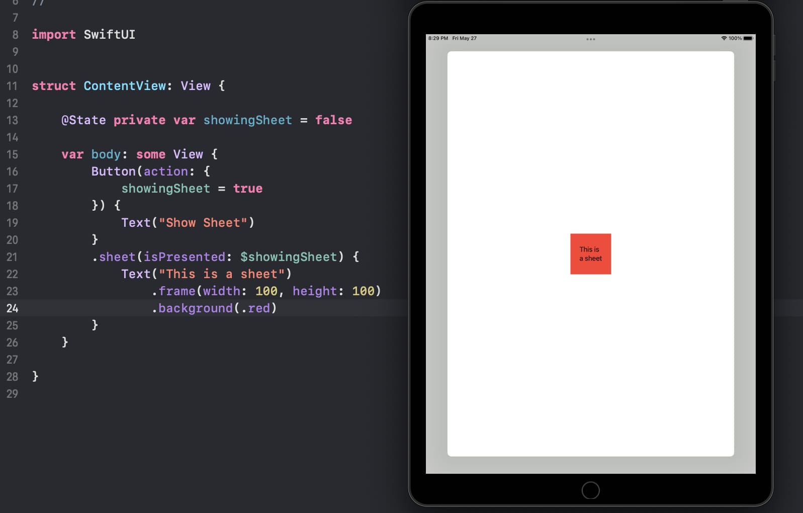 No, I’m not aware any workaround… unless you want to reimplement your own sheet.
2. Some control over the default spacing
Here’s the toolbar of the Notes app:
Here’s the SwiftUI replica:
The alignment of the toolbar buttons are slightly off:
Why? I don’t know. But if you set the maxHeight and maxWidth of the button to .infinity, you’ll notice some non-removable spacing around the button:
 And no, .ignoresSafeArea() doesn’t work in this case.
Similarly, it happens to views inside NavigationLink as well:
I wish it is possible to ignore the spacing.
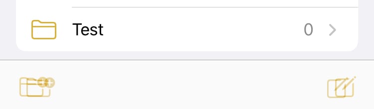
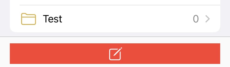
3. Miscellaneous improvements to edit mode in List
The Done text should be semibold in an
EditButton.The chevrons in
NavigationLinks should be hidden in edit mode. (It would be even better if we have some control over theaccessoryType.) Note the whacky animation of the chevrons.The items in a
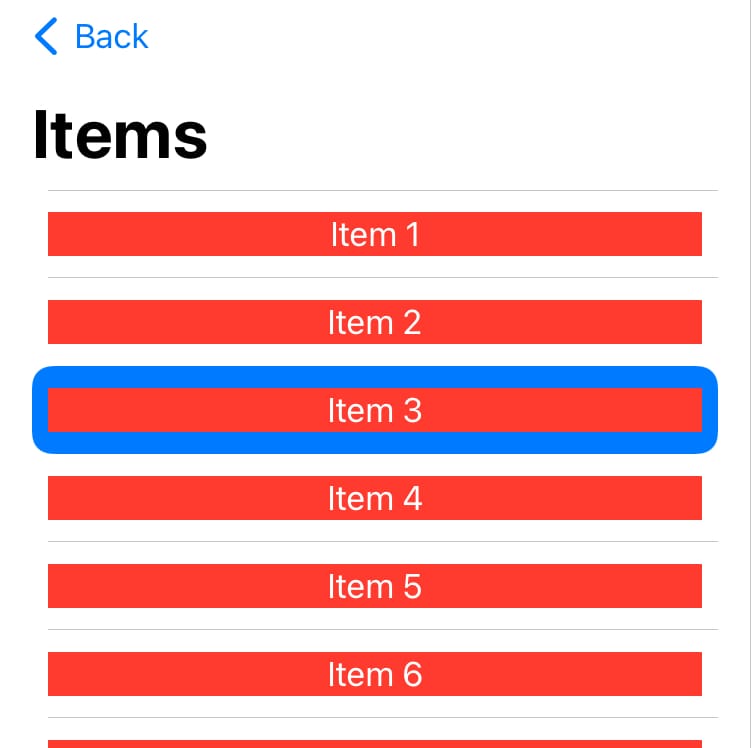
Listshould be clickable (e.g. to rename the items) in edit mode.The state of the highlighted item is buggy in a multiple-selectable
Listwhen theListenters/leaves edit mode.If the items in a
Listhave rounded corners, the.swipeActionsbuttons should have rounded corners as well.Make it possible to attach a
.confirmationDialogto a.swipeActionsbutton. Compare it with the confirmation dialog in the Notes app: Notice how the delete button expands instead of disappears when the confirmation dialog shows up.