

Redesigning the Subscription Flow, Part 2
As of now, the subscription screen of Time Capsule looks like this:
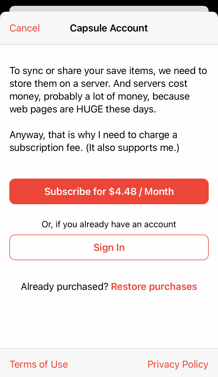
I’m pretty happy with the layout. It has all the elements required by Apple’s guidelines and doesn’t feel very custom or over-designed. The copy, however, needs to be rewritten.
Sync and share sounds vague. Most people probably think, “I don’t need sync and share,” and don’t care about the details like it needs a server. I was selling features, not benefits:
Features are things that your software does. Objectively speaking, Microsoft Powerpoint reads PPT files and lets you animate bullet points. Benefits are the perceived improvements in the user’s life that will result from purchasing your software. Subjectively speaking, customers of Microsoft Powerpoint buy it because it will let them close the deal, please their bosses, and get promoted.
With that in mind, I came up with this:
- Access your saved pages across all your devices, including mobile, tablet, and web.
- Export your saved pages as single HTML files with all the assets embedded.
- Browser extensions to save pages directly to the Time Capsule server.
Yes, it’s a reiteration of the subscribe button, but consistency is a good thing, right?